Unfortunately for Mr. Peters, two wrongs do not make a right.
For in his effort to make a map better than the Mercator map, he made a map just as awful. The distortion of the Mercator map expands the north, and it makes the entire globe look top-heavy. Peters responded to this by making the distortion in the north minimize its size while blowing up the equator and stretching it. The result is this:
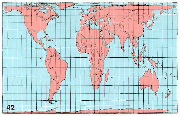
This was made as a response to this:

Here's the main problem with these maps. Any cartographer knows that there is no way to make a flat world projection without creating massive distortion. Any map, no matter how accurate, will never be as good as a globe. However, the best maps are those that have the least distortion.
The Mercator map is flawed because its authors wanted it to be distorted. This map is so unbelievably biased towards the north that it overwhelms everything else. According to Mercator, North America is larger than Africa, Greenland is nearly endless, and Scandinavia is larger than Australia. It is fairly obvious why someone from the Age of Exploration would want this bias. It makes Europe look more important than the rest of the world, thus making the explorers feel special.
The Peters map is flawed because Mr. Peters wanted it to be the opposite of Mercator. Peters shrunk down the poles and expanded the equator. The result is an unbelievably stretched map that simply looks off. According to Peters, Africa is the same size as Asia, and South America is larger than North America. It is so flawed that it's essentially equal to Mercator.
There is one main reason why both of these maps are so incredibly off. Look up at the grid lines on them. These maps are on flat grids. Every latitude and longitude line meets in perpendicular intersections. It is impossible to create a map based upon these settings that does not look incredibly distorted.
So why is this map still sitting on the wall of my AP English class? Why does the Mercator map still hang on the walls of half of my middle school classrooms? Why do people still use Mercator and Peters, and why is there still a debate between both camps?
Tradition. Mercator's been used for centuries. Peters directly challenges it. For anyone who looks at maps with the even grid, there are two choices. Peters is the politically correct one, and Mercator is the traditional one. Which one would you choose?
Personally, I prefer this one:

No comments:
Post a Comment